
10 Car Logos And The Surprising Stories Behind Them
Car logos can say a lot without uttering a word. I used to think the Subaru badge just looked cool – stars in a sleek oval.
Then someone told me it represented the Pleiades constellation and symbolized the merging of six companies into one. Mind blown.
Suddenly, that little badge had way more personality than I gave it credit for. Some emblems carry family histories, national pride, even hidden jokes.
What seems like a simple design often hides a backstory full of ambition, heritage, or pure marketing mischief.
1. Ferrari’s Prancing Horse
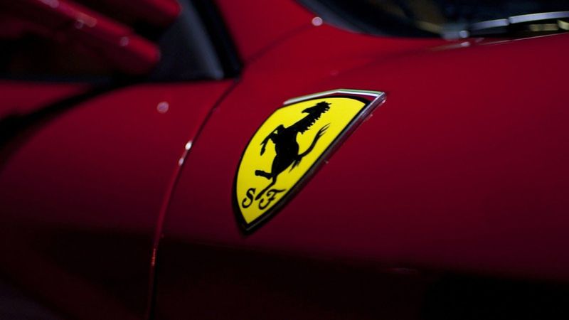
The famous black stallion wasn’t Enzo Ferrari’s creation at all! He borrowed it from Count Francesco Baracca, Italy’s top WWI fighter ace who painted the horse on his plane for good luck.
After Baracca passed away, his mother suggested Enzo adopt the symbol, believing it would bring fortune to his racing cars.
Enzo added the canary yellow background—his hometown Modena’s color—creating perhaps the most recognized automotive emblem in history.
2. Lamborghini’s Raging Bull
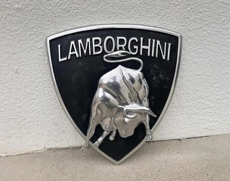
Revenge tastes sweet when served with horsepower! Ferruccio Lamborghini, initially a successful tractor manufacturer, once complained to Enzo Ferrari about clutch problems in his personal Ferrari.
Enzo dismissively told him to stick to tractors and leave cars to the experts.
Insulted and determined, Ferruccio created his own supercar company, choosing the fighting bull as his emblem—a direct challenge to Ferrari’s horse and a nod to his zodiac sign, Taurus.
3. Mercedes-Benz’s Three-Pointed Star
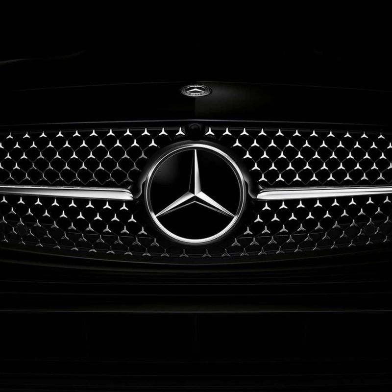
Talk about ambitious branding! The elegant three-pointed star represents founder Gottlieb Daimler’s vision of motorized domination across all elements—land, sea, and air.
Originally, Daimler drew this star on a postcard to his wife, marking the location of their home and promising it would one day shine over his factory as a symbol of prosperity.
Today’s chrome emblem sitting proudly on Mercedes hoods worldwide is the fulfillment of that personal promise made over a century ago.
4. BMW’s Blue and White Quarters
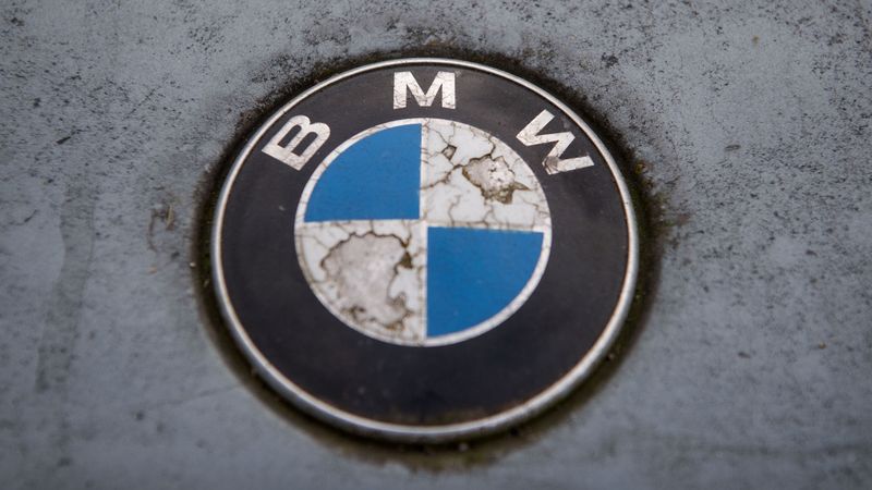
Contrary to popular belief, those iconic blue and white quarters aren’t spinning propeller blades!
The widespread myth claimed BMW’s logo represented airplane propellers from the company’s aircraft engine past.
The truth? The emblem simply incorporates the colors of Bavaria, BMW’s home state in Germany.
The company later embraced the propeller myth in advertising because it sounded cooler than “we used our state’s colors.” Sometimes marketing trumps historical accuracy!
5. Audi’s Olympic Rings
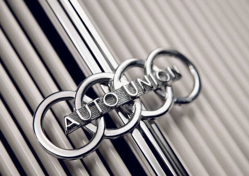
Those four interlocking rings symbolize a shotgun wedding of sorts! In 1932, four struggling German automakers—Audi, DKW, Horch, and Wanderer—merged to survive the Great Depression, forming Auto Union.
Each ring represents one of the original companies. August Horch, who founded both Horch and Audi, essentially created two of the rings himself!
The name “Audi” itself is clever wordplay—it’s Latin for “listen,” which is what “Horch” means in German.
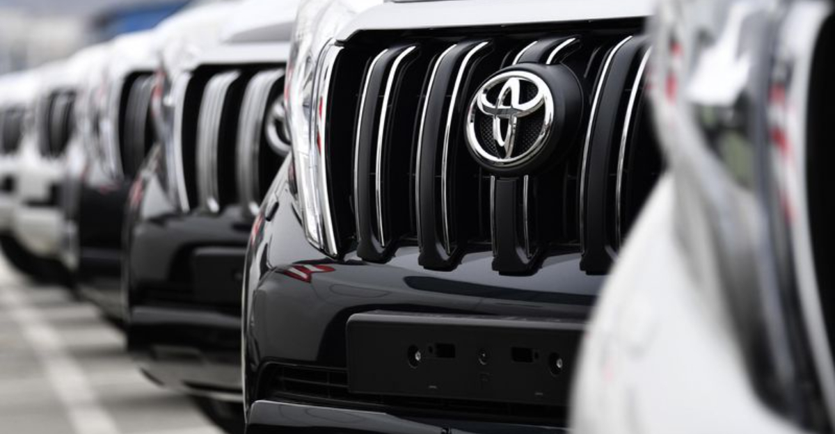
6. Toyota’s Hidden Message
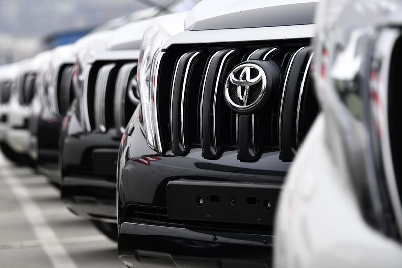
Squint a little and Toyota’s oval emblem reveals a secret! The current logo, introduced in 1989, cleverly contains every letter of the word “Toyota” hidden within its design.
The overlapping ovals represent the heart of the customer and the heart of the company joining together. Japanese companies love meaningful symbolism!
The space inside the logo forms a “T,” while the entire emblem resembles a steering wheel—practical and philosophical all at once.
7. Subaru’s Celestial Connection
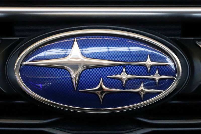
Look up at the night sky to find Subaru’s inspiration! The Japanese name “Subaru” refers to the Pleiades star cluster, known as the “Seven Sisters” in Western astronomy.
Though the constellation contains many stars, only six are visible to the naked eye—exactly matching the stars in Subaru’s logo.
The company was formed by merging six smaller companies, making the stellar connection even more fitting. Their cars might be earthbound, but their brand identity reaches for the stars!
8. Alfa Romeo’s Bizarre Combo
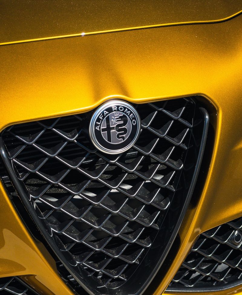
Medieval nightmare or car logo? Somehow, both! Alfa Romeo’s emblem combines the Visconti family’s serpent (called the Biscione) devouring a human with the red cross of Milan.
Legend claims the serpent represents a Visconti ancestor defeating a Saracen leader whose helmet bore this terrifying image.
Others suggest it symbolizes the family defeating Moorish enemies. Either way, it’s probably the only mainstream car logo featuring a creature consuming a human being!
9. Maserati’s Trident
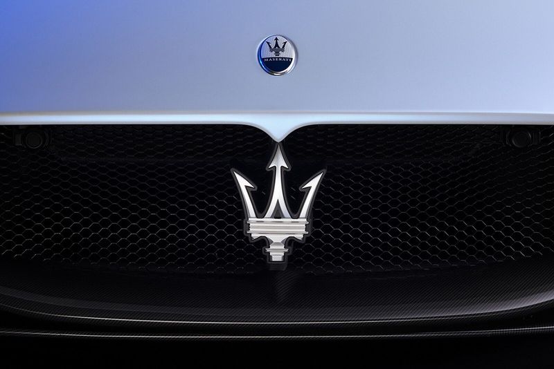
Neptune’s weapon became automotive royalty! The Maserati brothers didn’t look far for inspiration—they borrowed the trident directly from the famous Neptune statue in Bologna’s Piazza Maggiore, their hometown’s central square.
The brothers believed this symbol of strength and vigor perfectly captured their sporting luxury vehicles’ essence.
Red and blue elements represent Bologna’s traditional colors. It’s perhaps the only luxury car logo inspired by a specific piece of Renaissance sculpture!
10. Volvo’s Iron Mark
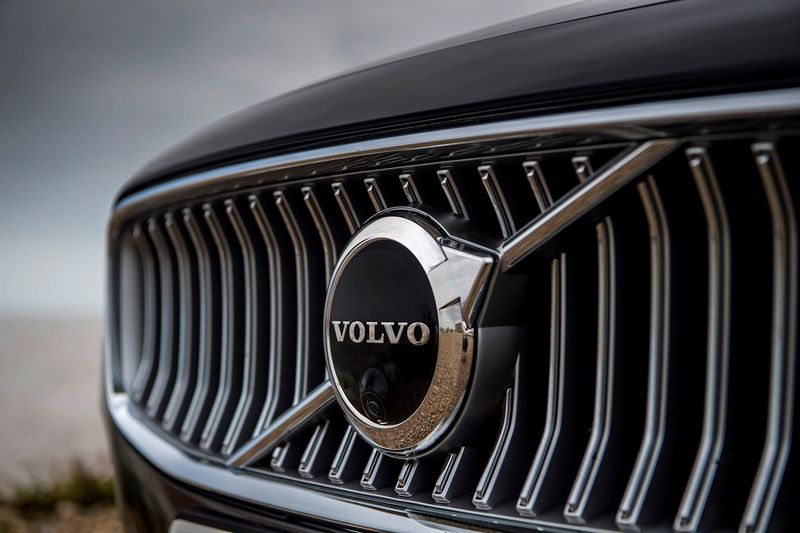
Safety-obsessed Volvo has a surprisingly warrior-like emblem! The diagonal arrow through a circle is actually the ancient chemical symbol for iron, representing Sweden’s famous steel industry.
The symbol simultaneously represents Mars, the Roman god of war, and the male gender in ancient iconography.
Early Volvo cars even featured this emblem attached to a diagonal metal bar across the grille, physically embodying the logo’s design. Safety first, but with a subtle nod to strength and durability!